Operable · Level A · 2.4.4
Link Purpose (In Context)
The purpose of a link should be clear from its own text, or from that text plus its surrounding sentence or list item. This specific success criterion is written for hyperlinks, but the identical failure — and the identical fix — applies to buttons and any other interactive control with a name.
- Blind
- Low vision
- Cognitive
- Motor
How to recognize it
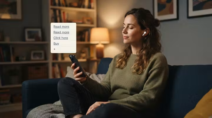
Pull all the links on a page out of context and read just the link text on its own — screen reader users do exactly this by browsing a 'links list', and it's also what a voice-control user hears when they say 'click read more' and get five matches. Common offenders: 'Read more', 'Click here', 'Learn more', '+', 'Buy', 'Add to basket'. Every one of these tells you an action exists, but not what it does or where it goes — buy what? add which item? read more about which of the ten products on this page? If you can't answer that from the link text plus its immediate sentence/list item, the criterion is failing. The same check applies to buttons: a screen reader's 'buttons list' or 'controls list' exposes their accessible names exactly the same way a 'links list' exposes link text, so a page full of unlabeled '+' buttons fails for the same reason a page full of 'Read more' links does. It also costs keyboard and switch-device users real physical effort: with unclear link text they can't tell in advance which links to skip, so they end up tabbing into a link, activating it, reading the destination, and navigating all the way back just to find out it wasn't the one they wanted — repeated across every ambiguous link on the page. And it costs people with cognitive disabilities orientation: a page full of identical 'Read more' links gives no way to tell which one matches what they were just reading, so they lose track of where they are in the page.
How to fix it
Rewrite the link text to name the destination or the specific action, e.g. 'Add wireless mouse to basket' instead of '+', or 'Buy the wireless mouse — $24' instead of 'Buy'. On a product listing, that usually means the link text needs to include the product name, not just a repeated verb. If the visual design genuinely needs short repeated text (an icon-only '+' control, a compact 'Buy' link in a grid), keep the short visible label but give the element a distinct accessible name via aria-label (e.g. aria-label="Add wireless mouse to basket") so it's still unambiguous with the destination stripped away. aria-label works identically on an <a> and on a <button> — it isn't a button-only technique, it's just overriding the accessible name of whichever element has the ambiguous visible text.
Example
Avoid
<a href="/roadmap">Read more</a><a href="/checkout?id=42">Buy</a><button onclick="addToCart(42)">+</button><a href="/mouse-wireless">Click here</a>Prefer
<a href="/roadmap">Read more about our accessibility roadmap</a><a href="/checkout?id=42" aria-label="Buy the wireless mouse — $24">Buy</a><button aria-label="Add wireless mouse to basket" onclick="addToCart(42)">+</button>